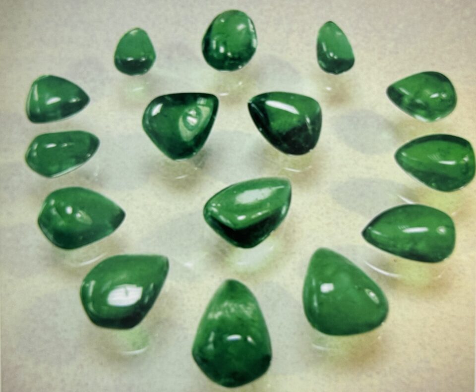
The term grading means categorizing the color and clarity of a gemstone so that it can be described in words. The cut is also graded for symmetry and proportion. I was a staff gemologist at GIA in 1982, the year the Institute introduced the Colored Stone Grading System. This grading system is fundamental to talking or writing about color. The terms are descriptive and precise, and they are used by trained gemologists and many others in the gem industry.
Other color systems include GemDialogue, by Howard Rubin, and the GemeWizard system, communication and matching of colors between supplier and client.
The three basic elements of gemstone color are:
- Hue: the basic color.
- Tone: the lightness or darkness.
- Saturation: the strength or intensity of the hue.
Hue
The basic hues are red, orange, yellow, a en, blue, violet and purple. These words are combined or modified to describe all the variations in between, such as “bluish green,” “orangy red,” etc. The GIA Hue Chart uses 31 hues.
These hue descriptions encompass all gem colors. Notice that the principal color is capitalized, while the secondary descriptors are not capitalized. You will see color expressed this way in the pages of this book. There are abbreviations for these color descriptions, but they are seldom used. You might have noticed that the yellow and green areas of the color wheel are more numerous: the human eye detects more gradations in those fields.
Very slightly bluish Green: the Emerald Color
Looking at the Hue Chart, only two of these colors are useful for describing emeralds: Green and very slightly bluish Green.
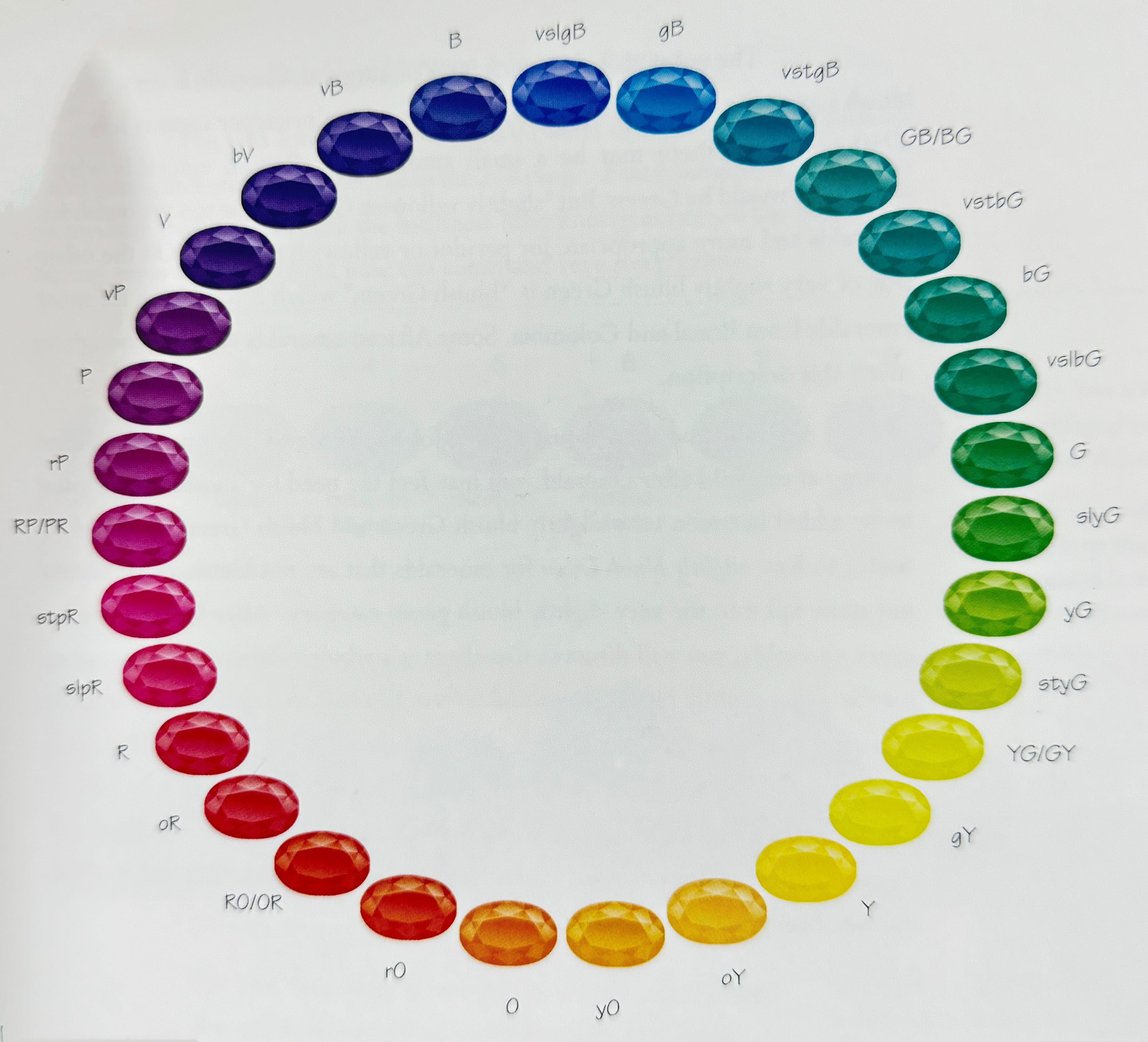

The color that describes 90% of all good emeralds is very slightly bluish Green. In commercial goods, emeralds whose price per carat is less than $750 per carat, there may be a small amount of yellowish emeralds whose descriptor would be Green. But “slightly yellowish Green” is far too yellowish for emeralds and more appropriate for peridot or yellowish tsavorite. On the other side of very slightly bluish Green is “bluish Green,” which is too bluish for most emeralds from Brazil and Colombia. Some African emeralds are blue enough to merit this description.
The hue chart is just a guide for beginning to describe colo: After looking at emerald after emerald, you may feel the need for another descriptor to be added between very slightly bluish Green and bluish Green, it would be useful to have slightly bluish Green for emeralds that are not bluish green but do not quite fall into the very slightly bluish green category. After looking at even more emeralds, you will discover that there is a whole rainbow of green colors just between slightly bluish Green and Green. You may also notice that emeralds do not usually just show one single color; they show two or three. The emeralds that are more yellowish always seem to have a dichroic bluish flash somewhere.
Also, there are slightly bluish Green emeralds that, when turned or moved, will show a dichroic yellowish flash of color. Texture, cutting and inclusions also affect the way that a color is presented.

Tone: Darker Is Not Always Better
The GIA Tone Scale runs from 0 (white or colorless) to 10 (black). Most gems, including emeralds, fall in the 2-8 range. Fine emeralds have medium to medium dark tones. When the liveliness (also known as fire) of the emerald is strong, even a medium light tone can command very steep prices.
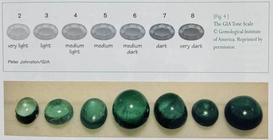
The GIA Tone Scale shows the terms that correspond to each tone. You will find yourself using these words frequently.
When talking about colored stones, many people say that darker is better. What they mean is “the more saturated, the better.” Saturation adds beauty and color; darker tones are desirable only up to medium dark. Note that “extremely dark” and “black” (numbers 9 and 10) are not used in descriptions of transparent gemstones. Even if a gemstone has black areas, the tone grade should correspond to the overall tone of the whole stone.
Saturation: From Vivid to Gray or Brown
Saturation describes the intensity of the color in six increments, from vivid down to gray or brownish. Cool hues such as blue and green become grayish as their saturation decreases, while warm tones such as red and orange grade down to brownish.
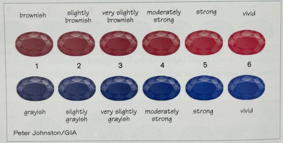
In red gemstones with medium tone, the modifier for warm tones, brown, increases as the saturation decreases. The saturation chart for Red shows this: from left to right: brownish Red, slightly brownish Red, very slightly brownish Red, moderately strong Red, strong Red, vivid Red. All are medium tone.
In gemstones with cool hues the modifier is grey. The saturation chart for Blue is similar: from left to right: grayish Blue, slightly grayish Blue, very slightly grayish Blue, moderately strong Blue, rong Blue, vivid Blue. All are medium tone.
Emerald color is located in between the warm and cool hues, in the center of the spectrum. In terms of saturation, emeralds should be described with whichever modifier observed in the stone. Most emeralds have some degree of bluish in them and are perceived as having cool hues. This would mean that the saturation descriptors (in the lower end of the saturation scale) should be in terms of grayish. There are emeralds whose green comes across more warmly; for those stones, the saturation descriptor would be brownish.
Source: Ronald Ringsrud – Emeralds A Passionate Guide
